Jet NYC
Strengthening resonance with NYC customer base
Jet.com creative direction, photo art direction
As Jet refocused it's customer base to urban millenials, New Yorkers came into special focus. As a brand born out of the city, we wanted to use it as a testing ground for a new micro-marketing strategy. A prong of that was the homepage, as the main image was regularly updated to reflect seasonality and stay current. A challenge that arised early on were the constraints we had to obtain this perfect New York image. This project is a solution, to that issue.
Concept Phase
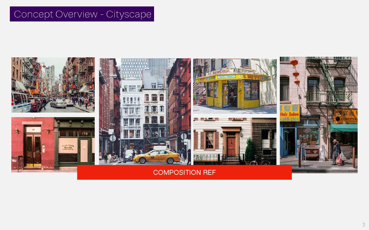
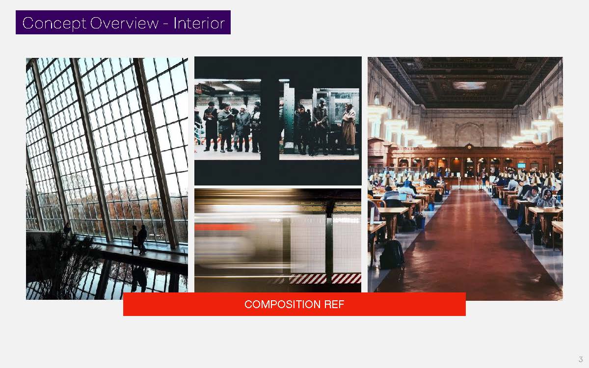
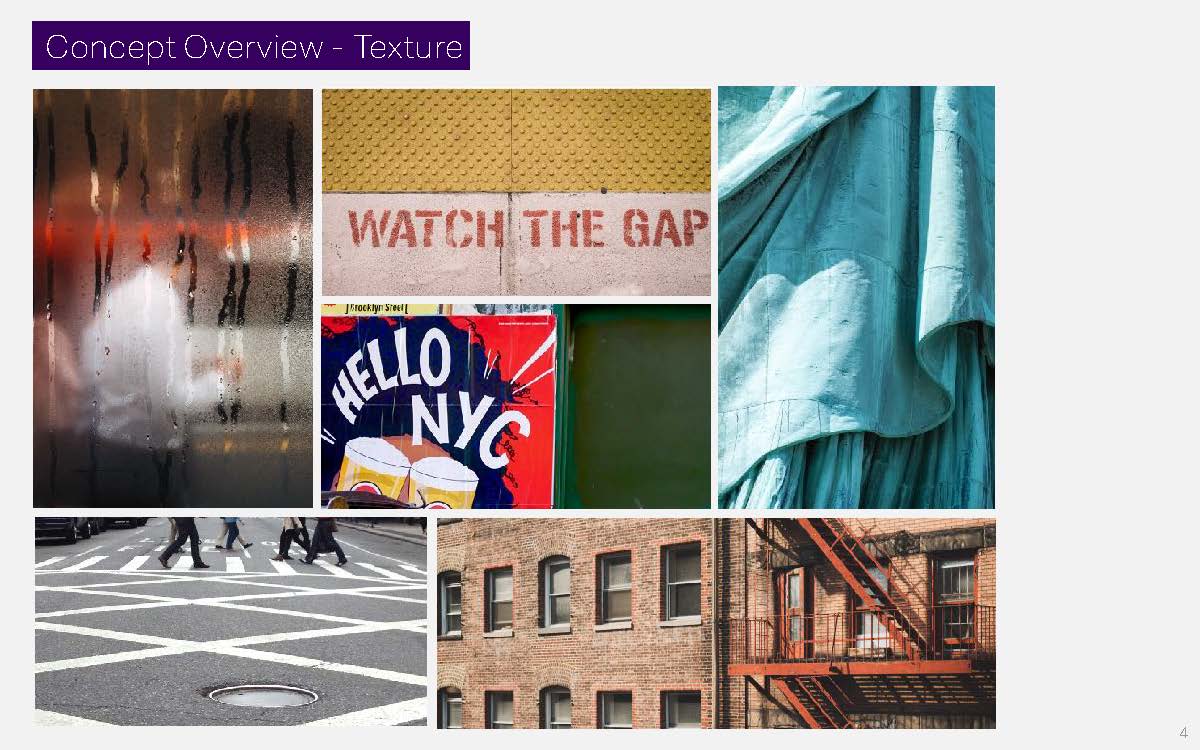
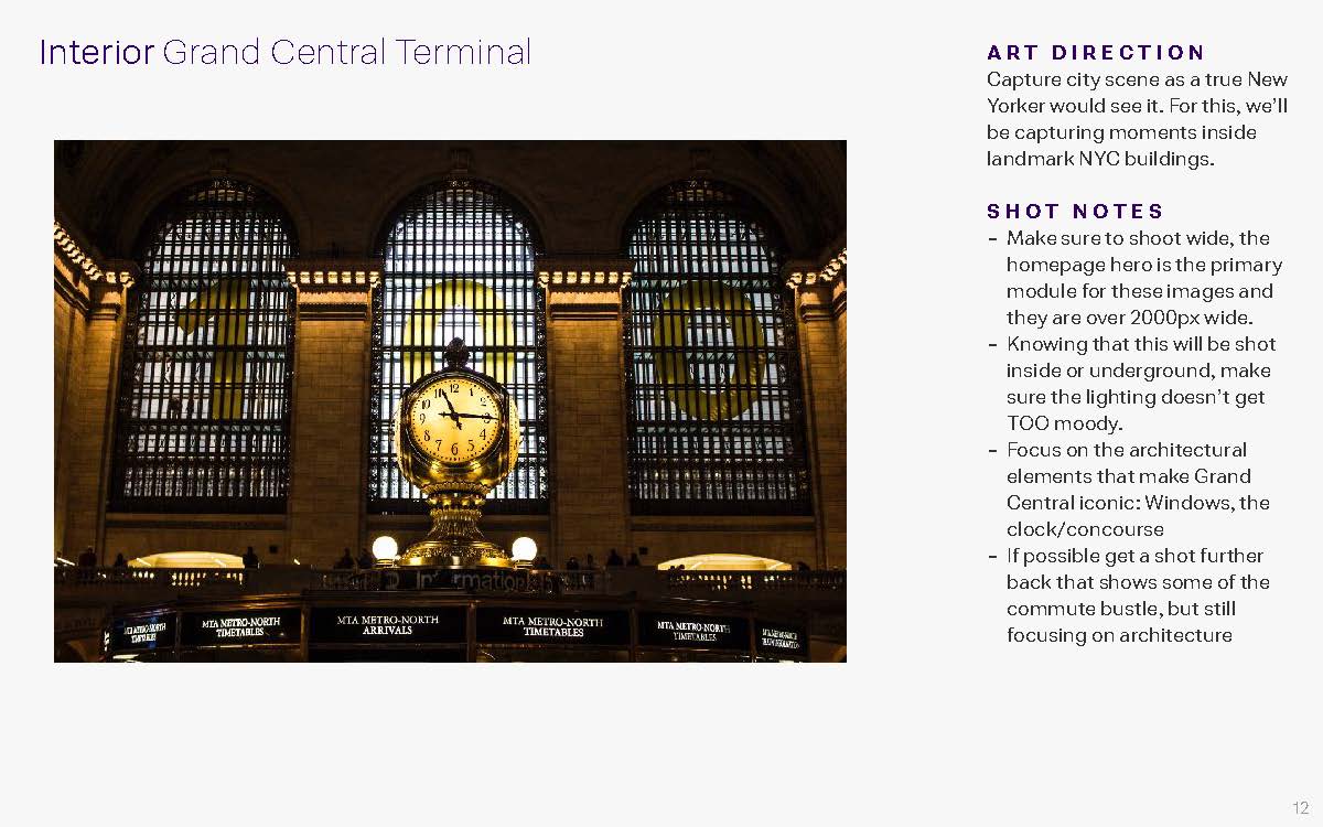
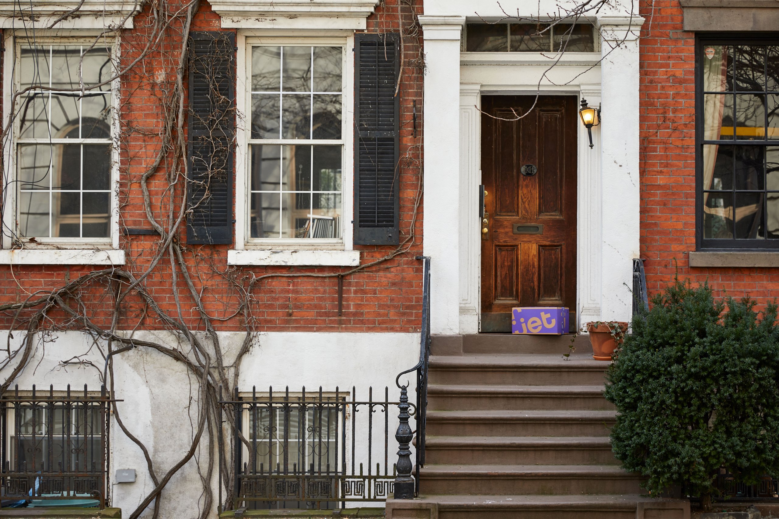
One of the main challenges was how to communicate NYC, visually, to New Yorkers themselves. It wouldn't only be sufficient to photograph iconic buildings and places, but we needed to represent everyday NYC life and icons. I brainstormed through various ways to bring this to life.
Photography
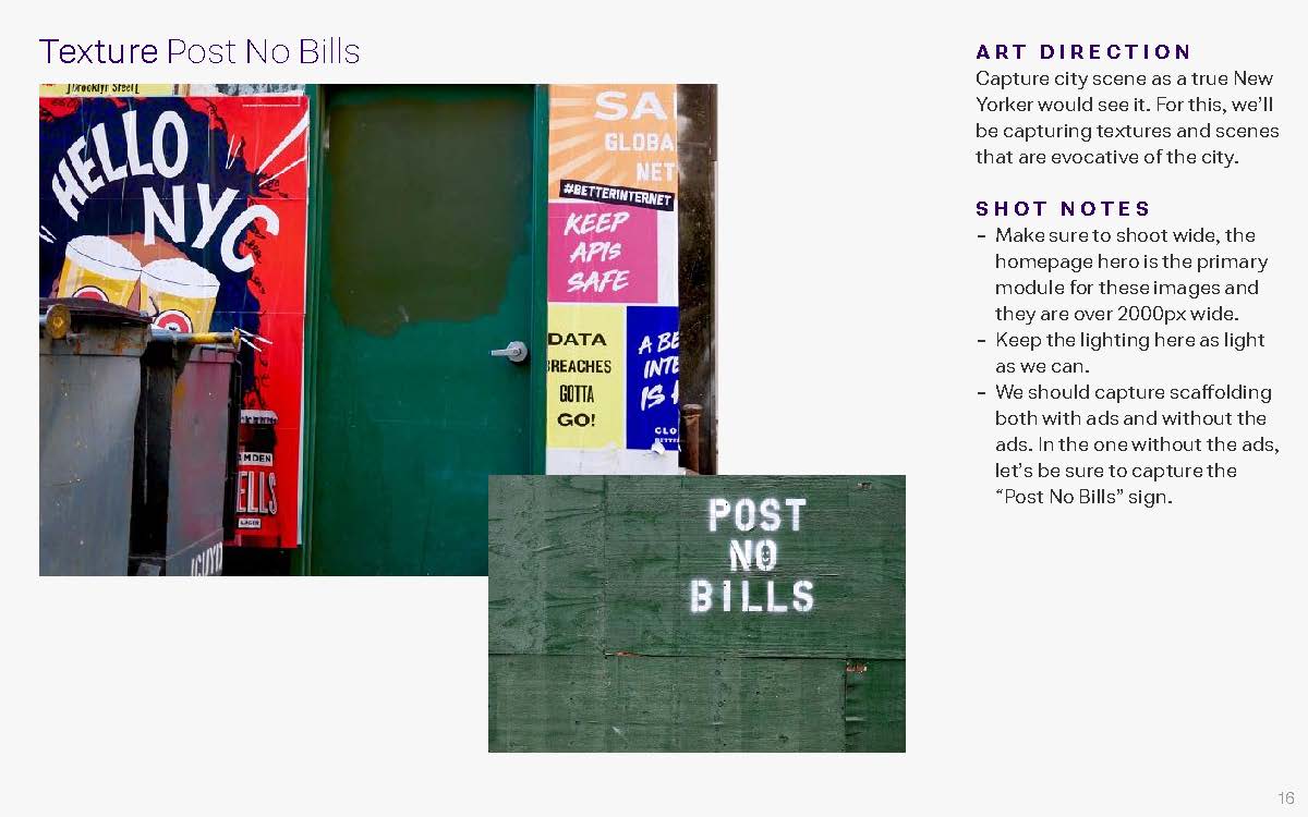
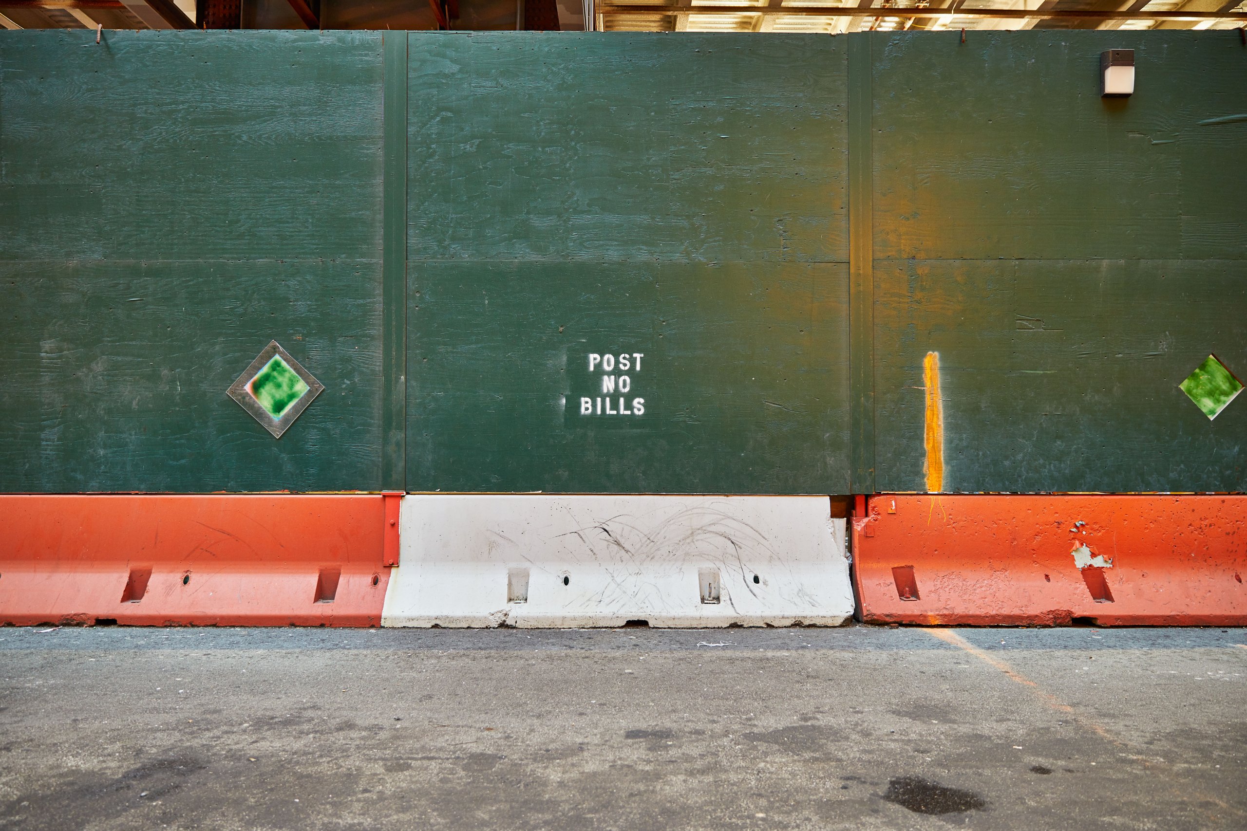
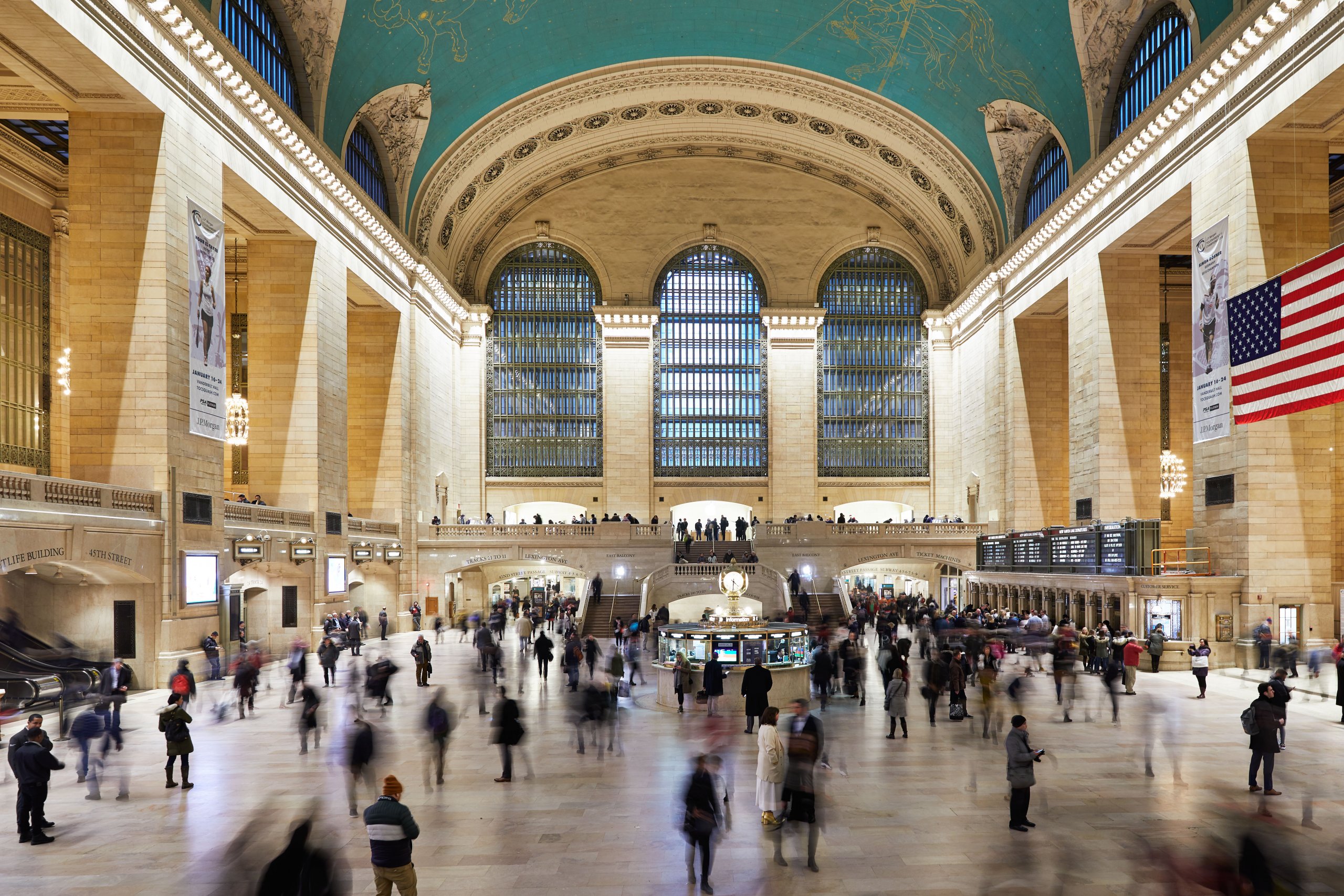
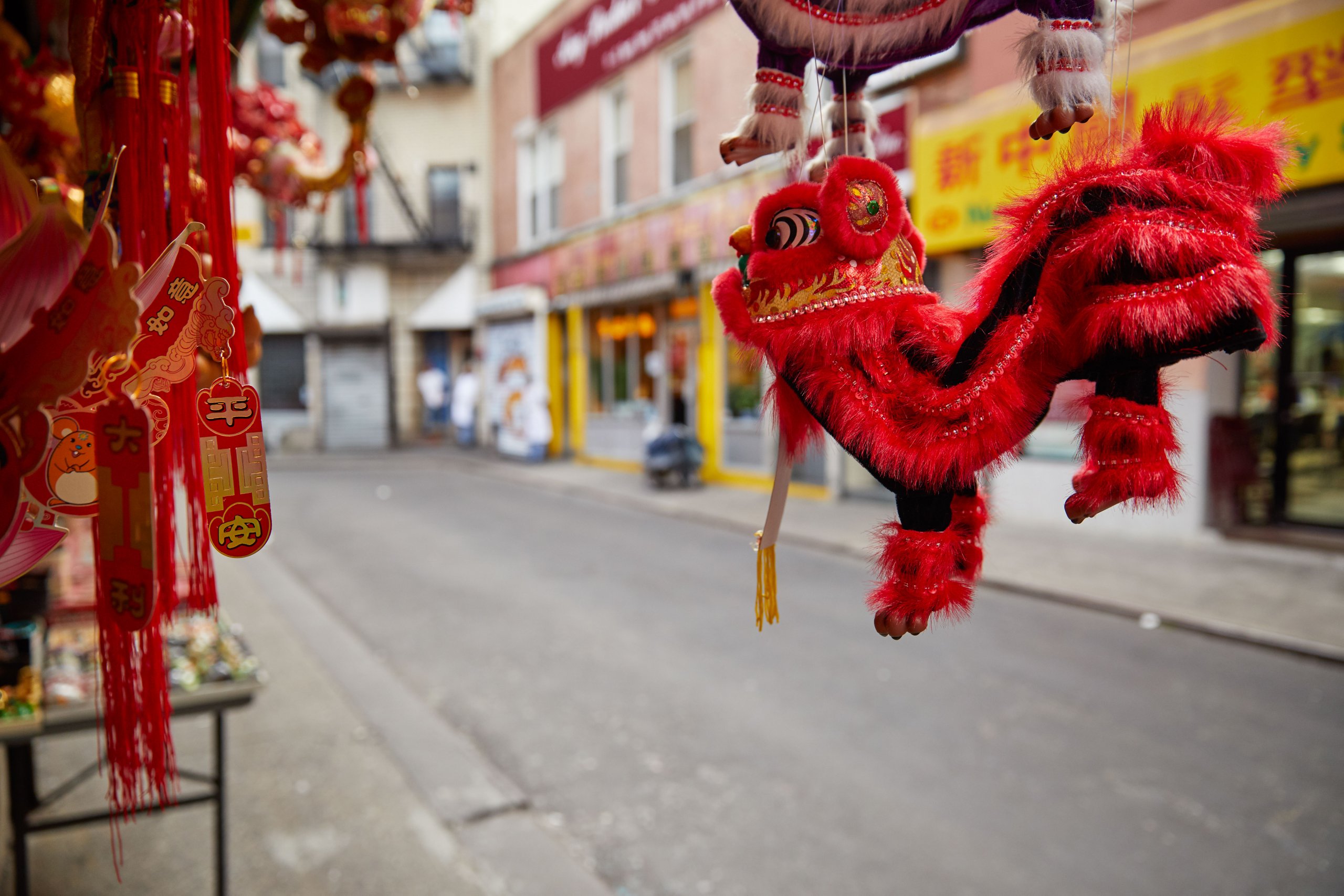
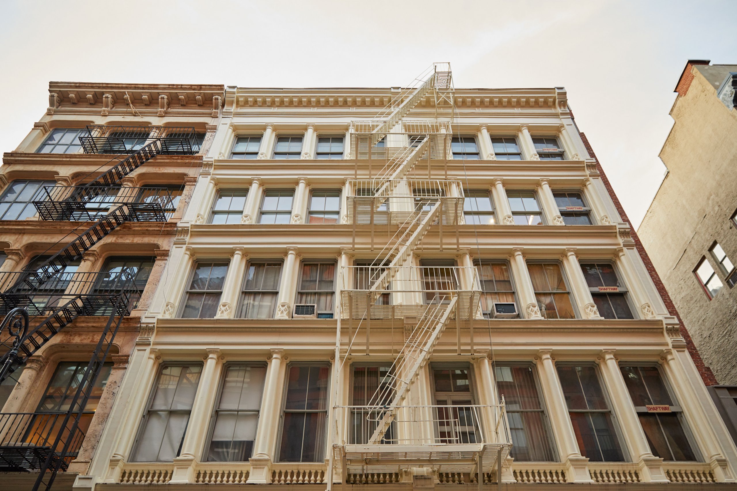
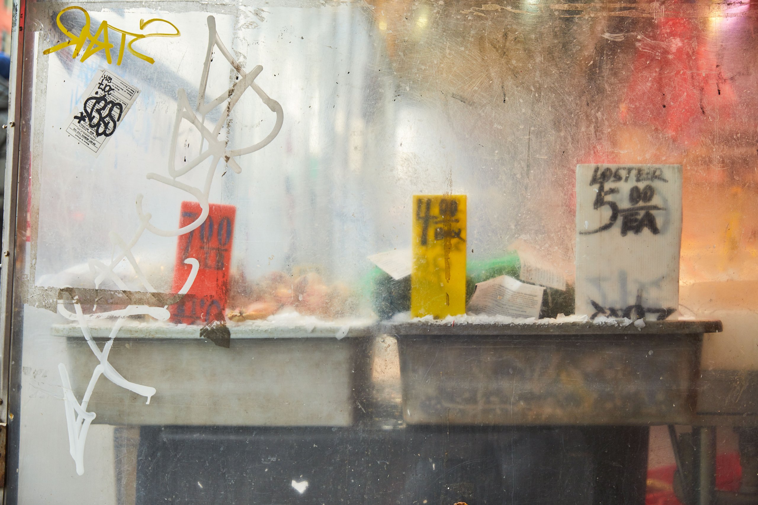
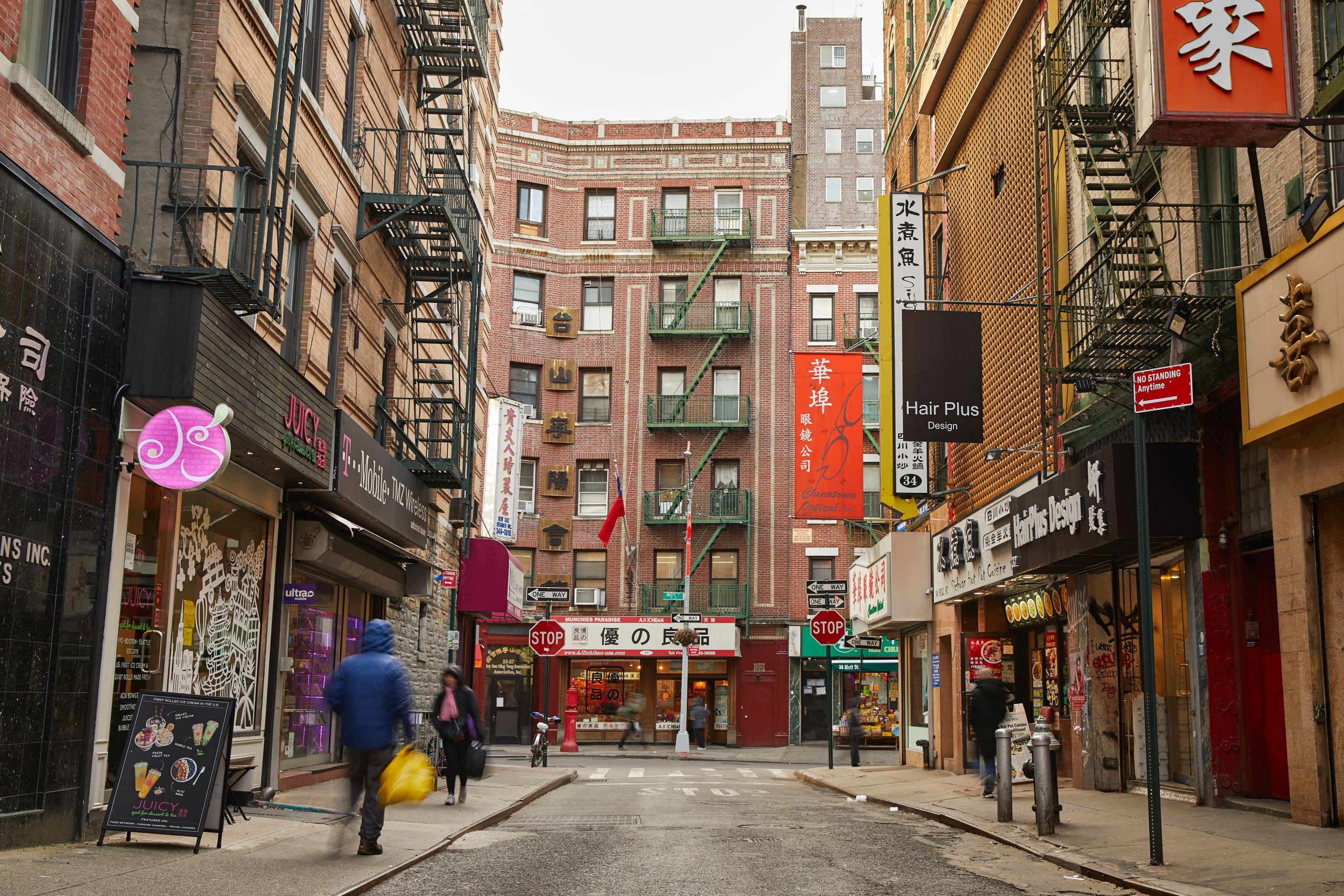
I landed on three visual themes: cityscapes, interiors, and textures. I worked closely with our in-house photographer and conducted monthly excursions, to create a bank of imagery for us to rotate throughout the year.
Final Design
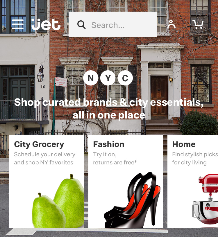
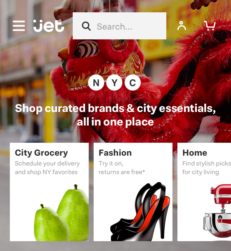
The final selects chosen were refreshed weekly on our NYC-specific homepage. Through the course of the year they displayed seasonality and special events in the city such as Chinese New Year and Pride. Below is a small selection of them in use.
Collaborators:
Jet.com Creative Director: Eurie Kim
Jet.com Art Director: Sophia Su
Photography: Shirley Yu
